As my magazine name, is quite
sophisticated and adult, i want to go for a basic front design on my front cover. This is so the front cover will not look to in your face and tacky, i believe less is more on the cover, which will make it look more professional.
This 'You' magazine this is the kind of effect i want to have on my front cover. The idea of using one colour as the b

ackground and fading it out, so that it is darker and lighter in certain places, works well. The fact that the photo of
Rihanna is
infront of the magazine name, draw my attention straight to the photo, this i what i want to do for my photo so that attention is at my model. Also the idea of not cramming in the magazine front cover with text, i think looks professional as only important information is on the front cover. The way that all the colours have been used and contrast to
Rihanna's dress work well, i would try and do this on my front cover.

This magazine; 'Vogue' again uses different colours as the 'You' magazine but the basic layout is used. Again i like the way the photo of the model is on a plain background, which makes it stand out even more. The clothes that the model is wearing contrasts well like the 'You' magazine to the magazine name. I hope to achieve this when making my magazine.

This is my mock layout. I want my magazine to have to the same layout and theme as the Vibe magazine. The magazine name works well with the grey background. However i will try out a red magazine name as i believe this could stand out more. The fact that this magazine has only used red, black, white and grey, works really well. I want to use this idea on my front cover otherwise there will be to much going on. I also want to use the idea of having a quote from the interview on Becki, which will hopefully influence the reader to buy the magazine.

 This is a contents page of the magazine 'spin'. I like the idea of having one image and placing everything around them. I think it looks very effective as your attention is straight away drawn to the image of the person. Again the image is infront of the text, this effect i have used on my front cover and i will experiment with my contents page to see if it looks good. The main features in the magazine are in bold, and a short description is underneath which i like the idea of this, as it tells the reader what they will be reading about. From this magazine i like the idea of having one image of someone as attention is drawn straight to them. I also want to have a natural image of my model as i believe it shows their personality out, which is what i want my readers to understand.
  This contents page of NME magazine has used a clear house style, of the blacks, greys, reds and whites. Using a house style prevents the magazine from looking to much. This contents page contains a lot of information which shows the reader everything that the magazine includes. I like the idea of using bold fonts and having the titles in capitals, which just adds to the text standing out. The image being the centre of the page draws your attention straight to it. Compared to the Spin contents page these are two different techniques to draw your attention to something. From this magazine i want to use the idea of having bold text which is dramatic and stands out on the page. I also like the idea of having a background colour behind the text, however i am not sure this will work with my contents page, this will mean me experimenting different ideas.
 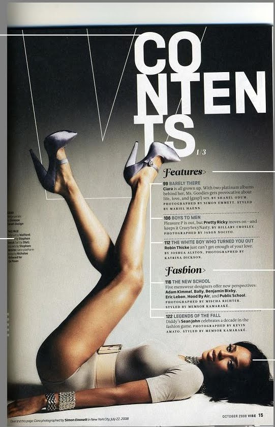 This contents page is from the Vogue magazine. The idea of the contents page being in that format, is extremely effective, especially the title. The colour scheme used works well and stands out on the grey background. The background has used a gradient effect, which means that the colour will either be lighter or darker. The text underneath i also think works well as it has different fonts, this just adds interest to the contents page. The page itself only have one image, which i believe works better than two images. Having one image draws yur attention to what is happening in the picture, which is the model posing. My faourite part of this cover is defiantly the title with the word contining on each line, i will be trying to use something like this on my contents page.


