Pages

Monday, 29 March 2010

Evaluation Question 2

How does your media product represent particular social groups?
The magazine 'musica' is aimed at the younger generation for the ages 16-21. The artist that this issue is based on is a popstar, this would reflect in the people buying the magazine, which i believe to be young girls. The clothes that Miss Valentine is wearing reflects her social group and status. As she is wearing a black tight dress and full make up, i think this shows her to be quite young, chatting and enthusiastic about herself and her music. I wanted readers to see Miss Valentine as someone they can relate to. This is shown through the interview on her as she comes accross as down to earth and exciting. I think my magazine is very similar to the girly pop magazines today. An issue of Vibe that i have based my front cover on, could be very similar to mine. The issues that i raised in both magzines are very similar.


Evaluation Question 1

In what ways does your media product use, develop or challenge forms and conventions of real media products?
My magazine title is very similar to the VIBE title, this is the magazine that i have based mine on. My front cover also has the same layout with an image of my artist and writing around it. However the VIBE magazine has one image where i have two this was because there was gap on the cover and putting the additional image helped. I have used on my front cover additional text about what the magazine includes, one of these is quotes from my interview. Most magazines includes things like this, so idea was so that it would make my magazine seem more professional. I have also included a date, price and barcode on my front cover. This is what all magazines consist of.

On my contents page i have wrote about what the magazines includes of. I have also used an image on my contents page. However this is probably the difference between magazines that i have created and researched. My magazine only consists of one image as when experimenting my magazine did not look professional with two. Also on my contents page i have wrote about subscribing for musica and how to contact them.

On my double page spread the main similarity would probably be the layout. However some magazines tend to have a clear divide between each page where my image continued on both pages. Also my double page was set out in columns and had a clear colour scheme. This colour scheme went on throughout my entire magazine, which is also known as a house style.

Friday, 26 March 2010

Interview

Hi ‘Miss Valentine’, this is your first interview since your number 1 single, how’s life in the spotlight then?
MV: hey, yeah it’s all very exciting, I still feel like I am that 16 year old girl revising for my GCSE’s. I’m not used to all the attention I am getting, its still going to take some time to get used to
Bet you love all the attention and the celebrity life style?
MV: Don’t get me wrong I love the life I am living at the moment, but I am quite a shy girl and still only 17 so not that confident to be honest.
So you know we are going to ask what is the truth are you dating Robert Pattinson?
MV: [Laughs] No, I wish. I have only met him once when I went to the MTV Awards, and I just started chatting to him, no we are just friends.
It makes me laugh how things are so easily twisted, as I used to be that girl who would read the magazines in shock that so and so are together and then believe it, but now I understand that not what all you read is actually true.
Ok then, so back to the single, how did you come up with it, as we all know you are talented musician?
MV: Thank you. Well I write my own lyrics and have been writing since I was very young, but when I started to learn to play the guitar I came up with different melodies and just loved singing and then began writing songs. I think because I am young and understand the music that young girls like I believed that my music could be popular to.
Well you have been very successful with your first single going straight to number 1, any album on the way?
MV: [Laughs] Wooo slow down. Yes I do hope to make an album soon, I have a few more songs that I like and would put on their, however they do need there final touches. But yes am album would be brilliant in the future, I am just so happy with everything at the moment and the number 1 has made my year and its only February.
Indeed, it has been a busy couple of months for you, and the music video is brilliant, did you choose what you wanted or do you have someone to do that for you?
MV: To be honest with you, I decide what I want to have in my songs and music videos; otherwise I believe it would not be my own work. I like taking control and bossing people around [laughs], lets me honest we all like being in control once in a while.
Good for you, do you not find the pressure to hard as you only 18?
MV: Yes the pressure is hard and I do have them days when I will just explode, but so does everyone regardless whether you are in the public eye or not. But I have a brilliant support system of friends and family that I know are always there for me, I couldn’t be more lucky.
That’s good then; have you meet any people that have been fake towards you, as you are famous?
MV: Luckily everyone that has been helping me has been brilliant and I haven’t met anyone yet like that. I know I will but hopefully by me growing up I will realise how to handle it and know who is my friend or who is just using me.
Well Miss Valentine, you seem to know exactly what you want out of your life and know how to achieve that, from ‘Musica’ and your fans we do wish you all the best and hope to catch up in the future with you.
MV: Thank you very much, and thanks for having me.

Double Page Spread Making

This is the picture i took of Becki. I had her sitting in a white dress as it worked well with the snow. I then had my cousin throw snow at her head this made Becki laugh, which gave off a really naturally look on the photo. I then changed the picture of Becki to colour and made the rest black and white. I did this on photoshop by cutting out Becki with the magnetic laser tool and copying her over to another sheet then simply changing the background colour to black and white on effects. I then copied the picture of Becki back into the image.


I then experiemented with photoshop and tanned Becki to see what it would look like. However Becki looked to orange and it did not go right with the snow in the background.


I then added an additional image of Becki at the top left corner on the double page spread. In this photo Becki is possing, which i wanted her to do. This is because all of her pictures are very natural and she is laughing and joking where as this is a serious model pose. I then gave the additional image of Becki a stroke effect which gave it the black outline, then gave it the outerglow. This made the image fade out into the background image.


I started to add text to the double page now. I began with the title and used a quote from the interview. I only wanted to use a basic font as i did not want to take the attention away from the picture of Becki. The colours i choose for the interview itself was the red as it matched Becki's lips and i choose white because of course the snow.


I then added the rest of the interview. However the quote at the top i rearranged as i was not ale to fit the entire interview on otherwise.

This is my final double page spread.


Thursday, 25 March 2010

Double Page Spread Research


This is a double page spread from NME magazine. The main focus of this double page spread is the image of Lilly Allen' and the quote, which has been pulled out of the interview which she has featured in underneath the quote and image. The quote has been taken from an interview this is shown by it looking like newspaper cuttings. The colours used, are plain and simple. However it gives an good aspect on the double page spread because it is bright and eye catching, grabbing the readers attention. This works well as the colours are dull but the image of Lily Allen contains colour which draws your attention straight to her. The background of the double page spread is all white. The main image of Lily, is placed at the right hand side of the double page spread. The shot used of her is a medium shot, which shows Lily from her waist up. The way Lily is posing also suggests the attitude of the article, which in this case is her dominating the page, by Lily leaning forward towards the reader, shows she doesn't care about what people think or the opions they have on her. I think this magazine double page spread is very effective and works well. For my magazine i want to make the title or quote as eye catching as this, especially the idea of newspaper cuttings, this is a very successful idea.


This is a double page spread from the magazine, Vogue. I have used Vogue magazine in my research also for my front cover. This double page spread is very distinctive. This is because the image takes up most of the pages, which clearly means attention is drawn straight to it. The image itself, is very different with a black and white effect in what it looks like an apartment. I think the image taken is effective and does look very professional as everything is in contrast to it. The clothing that the model is wearing again is dark and then light, however we are unsure whether they were black and white clothes ordinarily as the effect could have been added to his clothes as well.The writing being on either side of the page i also thinks well, again it focuses all the readers attention on the image. The choice of colours have been effectie The dark grey background with the white text, makes the text stand out. However choosing dark grey instead of the obvious choice of black, looks better. I believe this is because black would have looked to harsh, and i think this page is supposed to look sutel even with the dark colours. From this magazine i really like the idea of the image being extremely dominating on the page, i think thsi could work well fro my magazine as it would show off Miss Valentine's personality as being a strong character. Also the colour choice works extremely well, but it does not look dull in anyway.

Friday, 19 March 2010

Making Contents Page

This is the photo i have choosen for my contents page. The photo i think is very effective as the background is plain and nuteral. Also wear Becki is standing means i will easily be able to fit writing down the left hand side.


I then added my title to the image. I decided on using a large font for the word contents and smaller font for the word page. I think this worked well and looked quite effective. I also lighten the background colour, only slightly, however i believe it would make the text stand out more. I did this by using the dodge tool, which selects the background and not the image, and simply lightens it.


I then began to add relevant text to what is included in my magazine. I used different fonts for the subheadings and the actual pages. This has worked well as it makes the subheadings stand out.
I then decided to select the picture of Becki and move it alone thir showed a white background, i think thsi worked well and i decided to keep it like this. I also continued to add what else is included in my magazine using the same fonts and style.
Lastly i added the picture of my front cover, this is so that anyone can subscribe to Musica. I also added another text box and typed in the contact number so that people can subscribe.
My final contents page.

Contents Page Research

This is a contents page of the magazine 'spin'. I like the idea of having one image and placing everything around them. I think it looks very effective as your attention is straight away drawn to the image of the person. Again the image is infront of the text, this effect i have used on my front cover and i will experiment with my contents page to see if it looks good. The main features in the magazine are in bold, and a short description is underneath which i like the idea of this, as it tells the reader what they will be reading about. From this magazine i like the idea of having one image of someone as attention is drawn straight to them. I also want to have a natural image of my model as i believe it shows their personality out, which is what i want my readers to understand.


This contents page of NME magazine has used a clear house style, of the blacks, greys, reds and whites. Using a house style prevents the magazine from looking to much. This contents page contains a lot of information which shows the reader everything that the magazine includes. I like the idea of using bold fonts and having the titles in capitals, which just adds to the text standing out. The image being the centre of the page draws your attention straight to it. Compared to the Spin contents page these are two different techniques to draw your attention to something. From this magazine i want to use the idea of having bold text which is dramatic and stands out on the page. I also like the idea of having a background colour behind the text, however i am not sure this will work with my contents page, this will mean me experimenting different ideas.


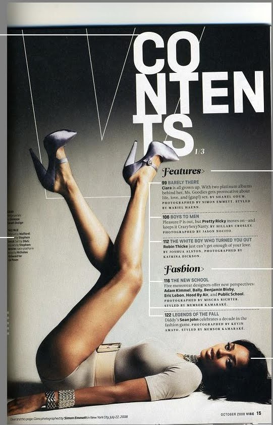
This contents page is from the Vogue magazine. The idea of the contents page being in that format, is extremely effective, especially the title. The colour scheme used works well and stands out on the grey background. The background has used a gradient effect, which means that the colour will either be lighter or darker. The text underneath i also think works well as it has different fonts, this just adds interest to the contents page. The page itself only have one image, which i believe works better than two images. Having one image draws yur attention to what is happening in the picture, which is the model posing. My faourite part of this cover is defiantly the title with the word contining on each line, i will be trying to use something like this on my contents page.